Marketing and design. Though different disciplines, the workings that drive them are quite similar. Their end goals are to elicit a certain response in someone, whether that’s to click on a button or purchase a product. They need to understand how their users approach problem solving and connect their needs to a solution.
In other words, they leverage psychology.
It’s no surprise these disciplines often intersect. Marketers, for example, write landing pages to get users to complete a certain call to action. Designers are called upon to create a landing page with a color scheme, layout, and type guide users to complete that action.
In this post, we’ll cover some common psychological theories and how they can be applied to the writing and design of your landing pages to increase conversions.
Do you want chicken or fish for dinner tonight?
The question, with only two answers, is straightforward. Yet what about the following:
Do you want chicken, fish, salad, hot dogs, or pizza for dinner tonight?
This question, with five possible answers, may take a bit more time to answer. Not only to have to identify each choice, but then consider each in relation to the rest. You may prefer hot dogs over pizza, but maybe chicken trumps them all.
In other words, the more choices you give someone, the more time they’ll take to make a decision.
This is the fundamental principle of Hick’s Law, established by William Edmund Hick and Ray Hyman. These two psychologists developed the law after examining how the presence of multiple stimuli affected the reaction time in individuals. Naturally, individuals need more time as the number of choices increases.
Hick’s Law is described using the formula below:
RT = a + b log2 (n)
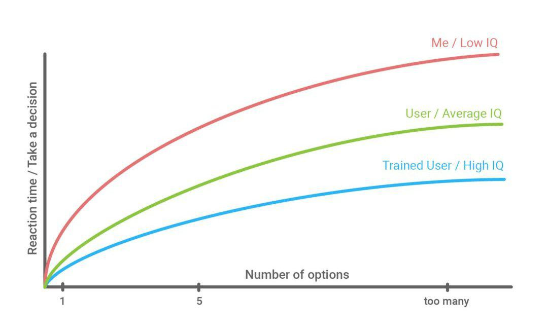
In this formula, RT represents the reaction (decision) time, while n represents the number of choices available to a person. The constants a and b represent the decision and condition under which that choice is made. For example, a could be to decide which shirt to buy and b could be the search you type into Amazon.
The above chart, courtesy of UX Planet, also displays the relationship.
The key takeaway from Hick’s Law is simple: reduce the number of choices to get a faster response from someone.
This fits perfectly with landing pages, which are designed to get a user to complete a specific action. When building landing pages, you need to consider what the user will to get there.
For instance, let’s say you’re building a landing page that will be used in a Google Adwords campaign. The ads will promote a free consultation for your company, which provides web development for small businesses. Signing up for a consultation is, therefore, the conversion.
If we follow Hick’s Law, we should offer as few choices as possible to lead them to a decision. Since the ad is promoting a free consultation, it makes sense to only offer this choice. Sure, your website may also have a blog and a downloadable eBook. But including those as landing page offerings would only delay (or even distract) users from converting.
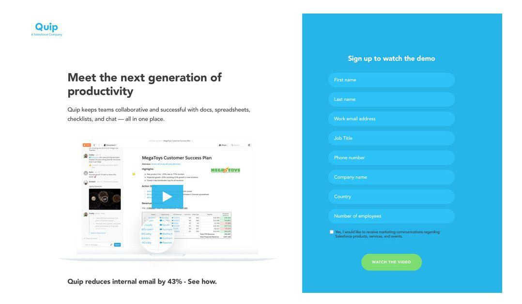
Quip, in this example did just that. They removed the menu and limited your options in order to increase conversions.
Image Source: Quip
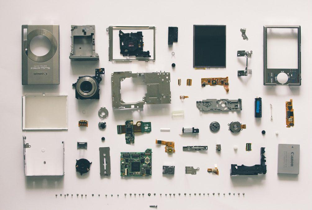
One of the most recognized design theories centers around the word gestalt, the name for a whole that’s bigger than the sum of its parts. Gestalt Theory emphasizes that people see the whole of something before its individual parts.
Developed by Max Wertheimer, Wolfgang Kohler, and Kurt Koffka, Gestalt Theory is comprised of the following six principles:
- Similarity: If individual elements are similar (e.g. color, size, shape), people will perceive them as a whole group. Similarity can also be used to emphasize a single, dissimilar element from the rest.
- Continuation: The idea in which our eyes are drawn along a continuous path, even if the path is comprised of individual elements. One example is the old network USA’s logo. We see the letter S though it’s not really present.
- Closure: The concept, similar to continuation, in which our eyes tend to see closed shapes even if they aren’t. In the World Wildlife Fund logo, we can see the panda bear’s head and body despite the presence of white, empty space.
- Proximity: If individual elements are close to each other, we will perceive them as part of a group. If these elements are also similar in nature, we will further perceive then to be part of a larger, complete object.
- Figure: Our eyes tend to separate objects (i.e. foreground) from their surroundings (i.e. background). This happens because our eyes want to focus on objects and surroundings in different planes of focus. Several optical illusions are created using this principle.
- Symmetry: Our minds naturally look for balance, order, or symmetry in what we’re looking at. This concept states that an image shouldn’t give the viewer a sense of imbalance, as our minds will look for the source of that imbalance (even if it’s not there).
If there’s one thing we can take away from Gestalt Theory, it’s that people tend to perceive as a whole or group over individual elements. This can be used to your advantage by creating what’s called a visual hierarchy in your landing pages.
If our minds are programmed to see things as a whole, then any element that doesn’t fit will immediately grab our attention. In other words, an inconsistency can be used to highlight your landing page offering, benefits, and call-to-action.
There are several ways to make this information stand out, including:
Contrasting Color (e.g. black on white)
Larger font
Bolding
And finally...
Surrounding white space
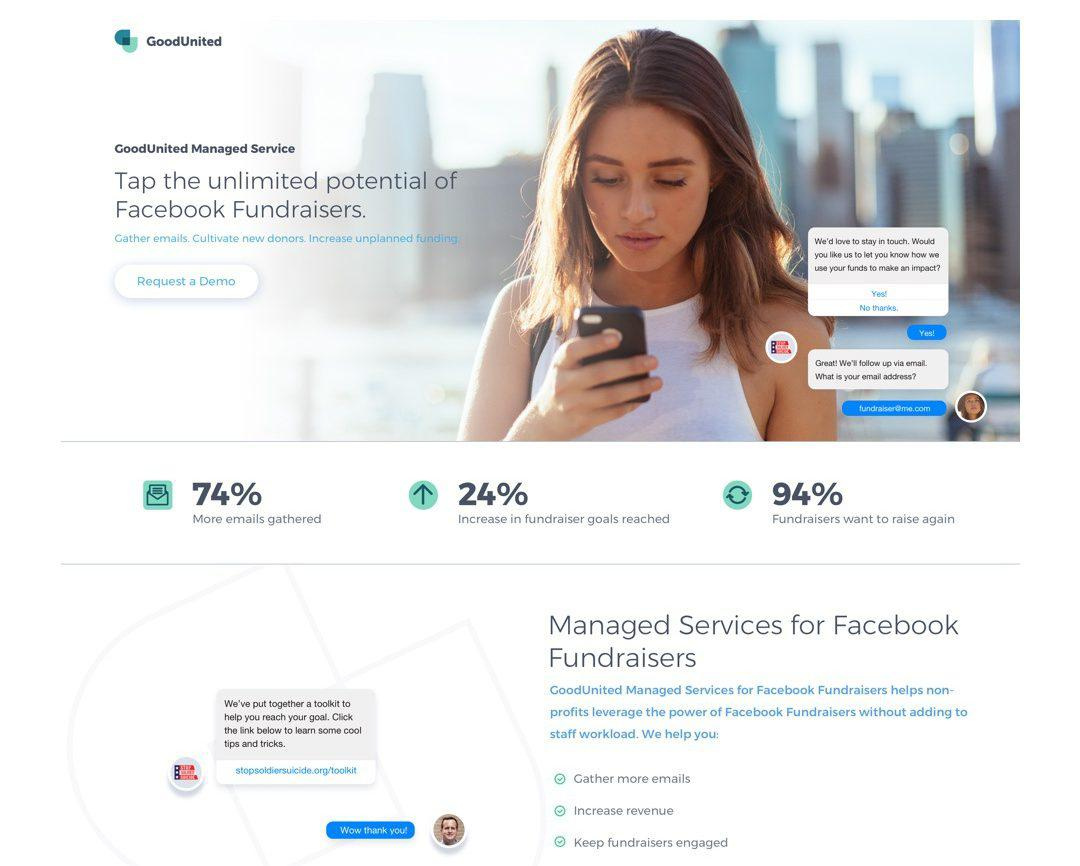
The landing page for GoodUnited makes good use of white space and font weights to group information together. The neutral colors makes it easy to show visual hierarchy by adding contrast.
When creating a visual hierarchy for your landing page, remember to use a different tactic for each element. For example, don’t use the same font size for your header, subheaders, and call to action. Otherwise, they’ll just blend together and your users won’t be able to easily identify important information.
Image Source: GoodUnited

Lying underneath the Gestalt theory is something more fundamental: people notice differences. Yet this is only part of the puzzle. Sure, people will notice a difference between a 12 and 48-size font word, but what about a 12 to 16 change? Or a 12 to 13 change?
Understanding the relationship between a change in stimuli (in our case, font size) and the perceived difference what the goal of psychologists Ernst Weber and Gustav Fechner. They developed what’s now known as the Weber-Fechner Law, which states that a noticeable difference is always in direct proportion to the original stimulus.
So… what does that mean? Let’s say we’re trying to measure the just noticeable difference between to shades of blue. We set the blue’s intensity at 100, then show it to someone. We then increase the color’s intensity by increments of one until the person notices a difference.
Let’s say the person notices a difference at an intensity of 150. The constant would be .5 (the difference of 150 minus 100, which is then divided over the original intensity of 100). We could then apply this constant to any other level of intensity. For example, if we were to set the blue’s intensity at 200, the just noticeable difference would be at 100 (.5 of 200).

The key takeaway from the Weber-Fechner Law is that people, given the right design choices, will notice a difference from its surroundings. Just Noticeable Difference, in particular, demonstrates the limits of human perception.
Yet this isn’t to say you should go ahead and write your header in extra large font for it to stand out. Indeed, this might elicit too strong a response that could turn off the user. It’s finding this balance between noticeable differences and extreme design choices that’s key to creating strong landing pages.
Take these 3 buttons for example. The first just looks like a blue link over white background. The second button is barely noticeable with the light border but could be the proper choice depending on the background and surroundings. The third button is a little trendy and calls more attention to itself. The differences are small but make a difference when compared to the original stimuli.

Related to, and arguably an improvement on the Weber-Fechner Law is Stevens’ Power Law. Developed by psychophysicist Stanley Smith Stevens, this concept similarly states a relationship exists between a change in stimuli and perceived intensity. However, this relationship, according to Law, is exponential.
In fact, one of the reasons that Stevens’ Power Law is considered an improvement is because he calculated the exponential value across many stimuli, including:
Type of Stimuli | Exponential Value |
Visual Length (Projected Line) | 1 |
Duration (White Noise) | 1.1 |
Brightness (Brief Flash) | 5 |
Loudness (3000 Hz Tone) | 0.67 |
By plugging in the exponent as “a” in the below equation, you could calculate a person’s perceived degree of intensity:
Also in the equation are the constant k and the stimulus magnitude I.
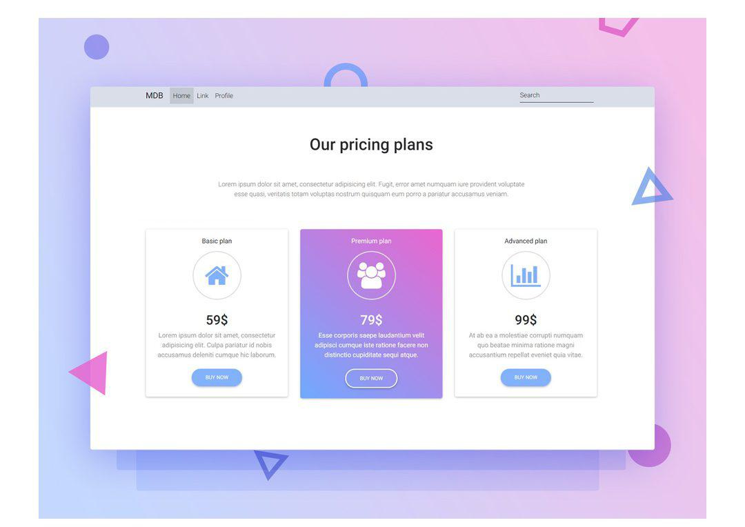
Just like the Weber-Fechner Law, Steven’s Power Law can be used to understand how to handles differences among the elements of your landing page. Color changes, for instance, should be treated differently than font size.
For example, let’s say we want to include a pricing chart that compares your company’s subscription offerings. We could use some styling change to highlight a particular option - as Freshbooks does on its pricing page:
Freshbooks offers three monthly plans, though the design makes its Plus plan - also it’s most popular - stand out in a few different ways. The wording “most popular,” though using the same color and size, it in a different font.
Now let’s look at the page’s use of color. The Plus column is blue, complete with a green CTA, that’s markedly different the white columns for the other plans.
While the color changes are more stark than the font, together, they help Freshbooks’ Plus plan stand out from the others.
Making Landing Pages Work for You
We’ve covered a lot of psychology in this post. People will try to see things as a whole over individual pieces. They’ll complete shapes and patterns in their minds though one may not be present. The degree of difference in an element can elicit stronger responses.
Understanding these concepts will only help you and your team design higher converting landing pages.
Image Source: Aga Ciurysek


